Build the skills your teams need
Give your teams the O’Reilly learning platform and equip them with the resources that drive business outcomes. Click on a feature below to explore.
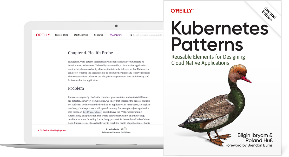
Trusted content you can count on
More than 60K titles from O’Reilly and nearly 200 publishing partners including Harvard Business Review, Pearson, and more. Plus over 30K hours of video, early release books, expert-created playlists, and more.
Live events and training courses
Your teams can take live training courses and attend virtual tech events with some of today’s most renowned experts, and ask questions along the way.

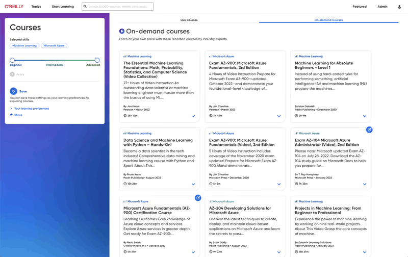
On-demand courses
Your teams get self-paced learning in all the tech and business topics they need, including cloud computing, software architecture, infrastructure and ops, programming languages, AI and ML, security, critical thinking, and more.
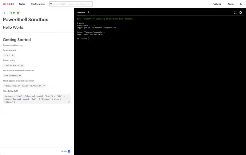
Labs and sandboxes
Get your teams up to speed faster with interactive labs and sandboxes. Our expert-guided and unstructured live coding environments let them safely practice with the most in-demand technologies and cloud platforms right in their browser—no setup needed.
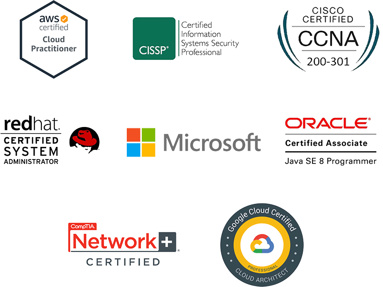
Certification prep
Your teams get direct paths to the official prep materials plus practice tests for the most sought-after technical certifications in the industry.
Generative AI responses from unrivaled content
Powered by AI, O’Reilly Answers instantly delivers trusted information sourced from thousands of top-tier titles, courses, and videos on our platform.
Help your entire org put GenAI to work
Every employee today needs to learn how to prompt GenAI, use it to enhance critical thinking and productivity, and more. With the AI Academy they can. For less. Available to team and enterprise customers only.
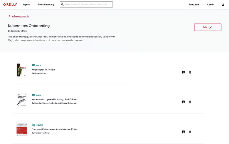
Assignments and curriculum curation
You can save, organize, and assign content from books and chapters, courses, labs, live online events, and more—and track each learner’s progress. Or create playlists of key content to build a curriculum to share with your teams or organization. Available to team and enterprise customers only.
Insights Dashboard
Understand more than just what your team members are viewing—know how they’re learning. Then compare their usage to competitors in your industry. Available to team and enterprise customers only.

Level up with expert-led live courses
Reserve your seat for interactive workshops to gain hands-on experience—and ask questions along the way.
Pick your eventsO’Reilly AI-powered Answers just got even smarter
O’Reilly Answers instantly generates information teams can trust, sourced from thousands of titles on our learning platform.
Discover AnswersMore than 5,000 organizations count on O’Reilly
O’Reilly Experts
We share the knowledge of innovators. You put it to work.
Tech teams love tapping into the minds of innovators through our expert-led courses, renowned text-based content, and bite-size online Superstream tech conferences. In fact, in a recent survey, one-third of tech practitioners rated O’Reilly content a five out of five (excellent)—better than Pluralsight, LinkedIn Learning, Udacity, or Skillsoft.
The 2025 O’Reilly Awards winners are in!
Learn who best put the O’Reilly learning platform to work for their organization and what the judges were looking for in winning submissions.
See the resultsHear why Jose is on O’Reilly every day
Jose, a principal software engineer, trusts our learning platform to filter what his teams need to know to stay ahead.
See why Addison loves our learning platform
Addison always appreciated O’Reilly books, but the learning platform helped take her skills to the next level.
Amir trusts O’Reilly to find the answers he needs. See why.
For over eight years Amir has counted on our learning platform whether he needs proven methods to learn new technologies or the latest management tips.
Mark’s been an O’Reilly member for 13 years. See why.
Mark credits the O’Reilly learning platform with helping him to stay ahead at every turn throughout his tech career.